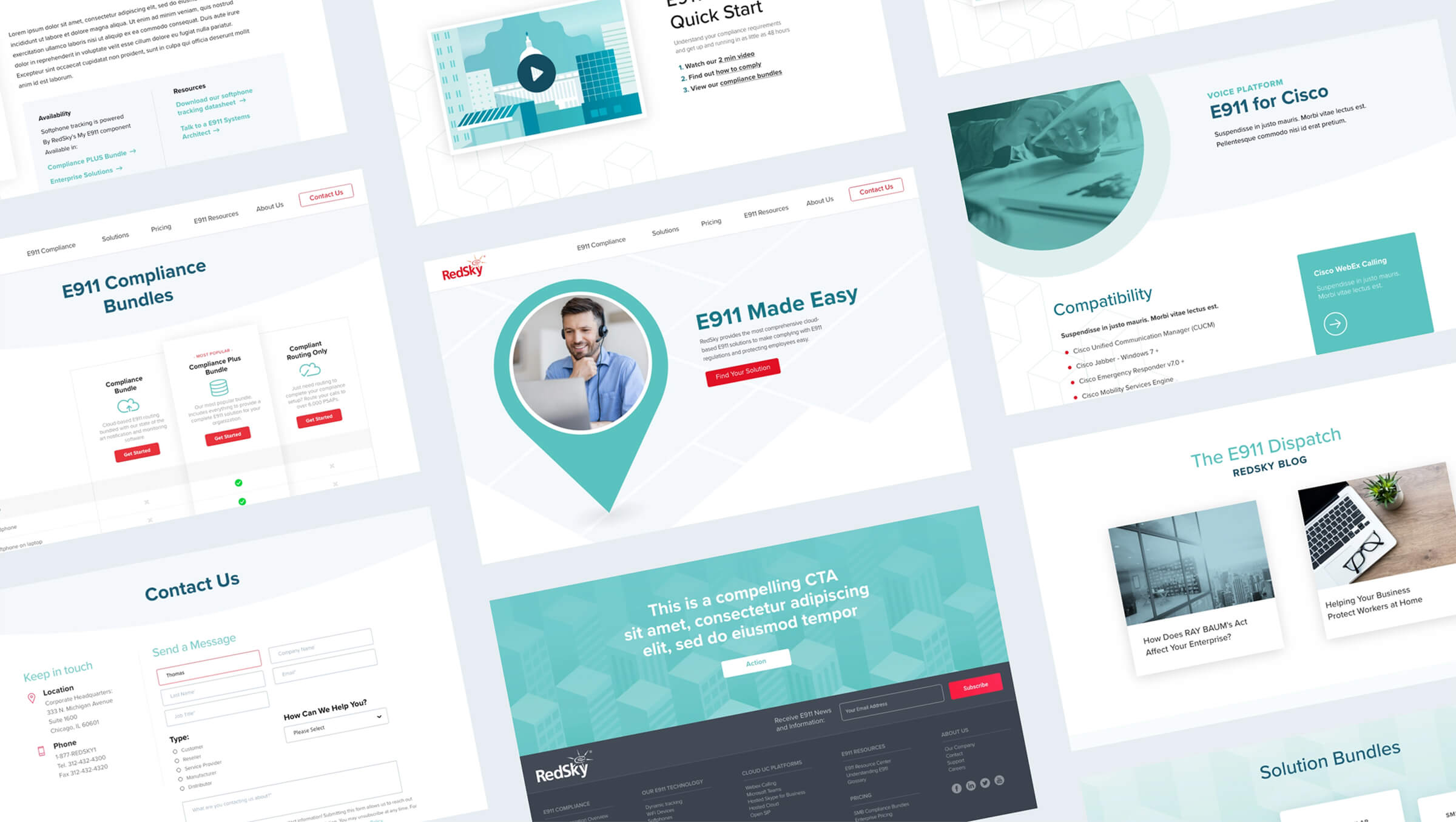
RedSky Technologies Website

  • Branding
  • Website Development
  • Marketing Automation
  • Content Management

Background/Objective

  • Branding
  • Website Development
  • Marketing Automation
  • Content Management

RedSky is the leading provider of E911 technology, helping first responders pinpoint the exact location of emergency callers, even within complex corporate networks. Across millions of endpoints in North America, RedSky helps businesses stay compliant with legislation that requires this lifesaving technology.

As a long-term client of Sonnenberg Group, RedSky asked us to refine their digital presence through a new website. This involved updating their core messaging strategy, SEO footprint and lead generation infrastructure.

Strategy

In addition to a fresh new aesthetic, our digital assets needed to drive a meaningful outcome. By combining thinking, design and technology, we crafted an engaging user experience that:

  • Clarifies RedSky’s solution offerings
  • Establishes RedSky as THE trusted source for E911 compliance
  • Delivers a consistent pipeline of warm sales leads

To drive growth from new traffic sources, we built a comprehensive E911 glossary, leveraging SEO to demonstrate RedSky’s authority as the most helpful and easy-to-use provider in the space.

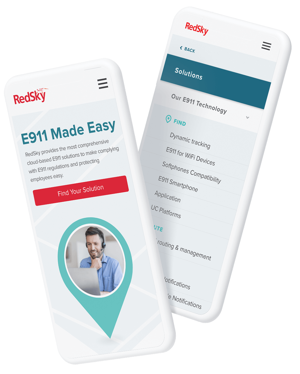
Meeting People Where They Are

Once on the site, customers discover tailored solutions for their specific technology infrastructure and compliance needs, through an intuitive user flow.

They are then offered multiple ways to engage and convert, depending on their stage in the buyer’s journey and individual communications preferences:

  • Targeted and customized HubSpot forms
  • In-depth articles, clarifying new compliance legislation
  • Intuitive chatbot flow
  • Enticing lead-capture resources and blog posts
  • Compliance Quickstart guide on homepage

Design

Although RedSky’s previous red and black color palette seemed to fit their emergency solutions, we proposed an alternative that would differentiate the brand and make a lasting impression on customers.

Instead of a stark and dramatic 'emergency' look and feel, we used blues and greens to convey a sense of calmness and peace of mind - the same feelings that customers would experience after engaging with the company.

Red is still used sparingly, to highlight certain important elements.

Colors

Typography

To deliver on RedSky’s brand promise of “E911 made easy”, our mission was to develop the best-in-class technical diagrams in the Unified Communications space.

Instead of using overly complex, two-dimensional, stock diagrams like other technology companies, we created custom, isometric illustrations to quickly and effectively convey information visually.

Along with these diagrams, we built a cohesive visual world through illustrations – conveying a brand that is warm, approachable and human.

More Case Studies