Criteria Corp Website

  • Website
  • SEO
  • User Experience

Background/Objective

  • Website
  • SEO
  • User Experience

Companies use Pre-employment testing to screen job applicants based on their skills, knowledge, cognitive ability, personality, and trustworthiness. Criteria Corp sets the gold standard for these services, boasting the most comprehensive selection of assessments in the industry. They cater to a broad customer base, with a wide range of tests, each with several different applications.

Criteria had just gone through a rebranding process and with that, wanted to update their website to reflect that both aesthetically and communicatively. While their website was outdated, it had a great SEO presence, so it was critical that we didn’t lose any ranking and look for ways to enhance. Another big priority was to gain more traction with enterprise clients. Lastly, Criteria wanted a very flexible website that could be expanded easily by site editors without the need for developers.

Planning

We looked at Criteria’s strengths, did a competitive analysis and quickly saw that Criteria had a much more rigorous science-based approach than the field. We planned to amplify that message throughout the site. This included a “Science” tab, site-wide messaging and a graphical approach that included metrics.

In our deep dives with leaders from various departments, we noticed that small and medium-sized businesses (SMB) and enterprise level organizations had significantly different concerns to address. Because of the flexibility of Criteria’s evaluation platform, it was important to address each of these audiences separately.

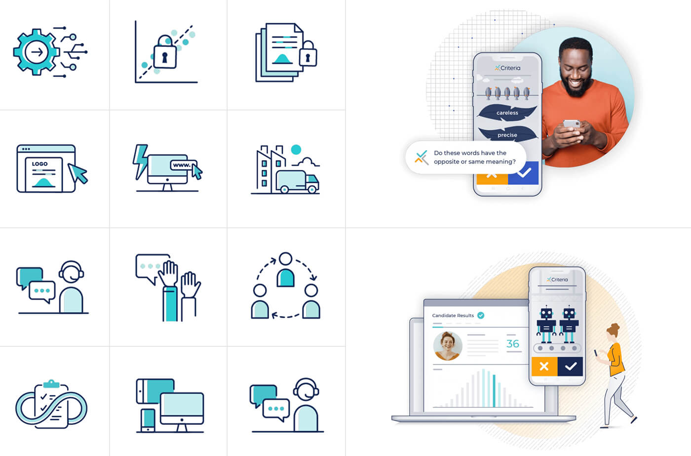
To create a more user-friendly and aesthetically pleasing experience, we planned to give each testing category (cognitive aptitude, personality, emotional intelligence, risk, and skills) its own subpage and visual identity. This allowed distinction across testing categories, but continuity between them so visitors can easily understand the breadth and purpose of Criteria’s assessments.

Design

We started with “stylescapes”, which are more detailed than mood boards, but less detailed than full page design comps. This allowed us to explore several visual territories and hone in on the right aesthetic. Concurrently, we designed and refined a series of wireframes for the various layouts we anticipated on the site.

With that aesthetic and wireframes in mind, we dove into full page designs, with our design team working together with Criteria’s talented design team. The site has a distinctive “chevron” on most pages, which ties directly into the checkmark in their branding. We thought it was important to make sure that the humans behind the data weren’t lost, so another distinctive touch was the blending of data visualization graphics with photos of real people throughout the site.

In the assessments section, we wanted to convey that the Criteria’s assessments make up a more holistic, broad dimensional view of candidates. So, each category is highlighted as part of that whole circle, with its own color identifiers that carry through to the assessments.

Call-to-action (CTA) buttons appear throughout each page, giving the visitors many opportunities to engage: free trial, ebook downloads, chat and an ROI calculator.

Colors

Typography

Technology

While our strategy and design teams worked closely with Criteria on internal assets, our engineering and development team did the heavy lifting of building the new site's entire back-end architecture.

We wanted to make sure the site was fully customizable, allowing users with no technical or coding knowledge to change content and design without 'breaking' the elegant functionality of a fully custom website. To do this, we used Drupal content management system (CMS) and created a powerful and flexible template system that allows Criteria to build pages with endless combinations of content and styling. Everything just works, responsive on any device, exactly as the content creator would expect.

As with any site migration, we wanted to capture the SEO traffic-generating power of the old site. Criteria Corp. had a rich backlog of content, which we cataloged, organized, and redirected to fit the new, streamlined user journey.

Outcome

SMB and Enterprise prospects enjoy unique journeys which address these two critical segments in a more targeted way, crucial to the first touch of the sales process.

With a more streamlined user experience that guides prospects through a journey personalized to their needs, the new site is optimized for higher conversion and greater customer satisfaction.

Criteria is the most data-driven, scientifically-backed provider of testing solutions and their new site reflects that as well. It enjoys a robust SEO presence, leveraging and building on previous traffic-generating content that now points to an enhanced, more effective lead-generation engine.

More Case Studies